What I’ve Been Lettering

Lately I’ve been seizing any possible opportunity to practice my lettering. Here’s what has come out of that:

IMG_20180214_172833_204This little piece came from participating in Lauren Hom’s weekly #HOMwork challenge, which you can sign up for here.


The next two letterings were also part of #HOMwork. I lettered them with my Wacom tablet instead of on paper which was a challenge for me, but something I’d like to get better at.

Lies(This is usually not true, just FYI).


Trophy3(This is always true for me.)


Another opportunity that I’ve been blessed with is getting to design wedding invitations for my friend. I lettered the names of the bride and groom using watercolors.

AubreeInvitation.indd

I also got to address the envelopes (SO FUN!).

IMG_20180309_170419920_HDR

I’ll be posting pictures of the full invitation and other pieces from the wedding soon!


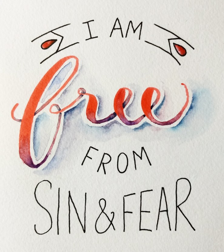
And finally, I use lettering to express gratitude for things that I love.

IMG_20180313_175949_469

IMG_20180116_121229_439

Thanks for reading!

Cook for the Cure Team Identity

A couple of weeks ago I was a part of the 13th annual Miller Brooks Cook for the Cure® Benefiting Susan G. Komen® Central Indiana. Through these events, Miller Brooks has raised over $125,000 to aid in the fight against breast cancer. This year, the Miller Brooks staff formed 4 teams and faced-off in an epic sandwich smack down. Each team cooked up 2 different types of sandwiches, a side, and a drink. Then guests voted for their favorite.

As part of the event, each team created a unique identity. I designed the identity and signage for my team, “Damsels of Delish.” Having all female members, we went with a dainty, elegant look. Our sandwiches were small ones that belong in a tea party (we had tea too). I chose to use simple line work to design a logo with a swirly motif similar to the pattern that you might find in a lace tablecloth, while also incorporating our commodities: tea and sandwiches.  2014-10-10 17.04.292014-10-10 12.15.20 2014-10-10 12.15.052014-10-10 12.02.09

More Internship Projects

Greetings! I hope everyone is surviving this Polar Vortex. I’ve been layering clothes during the day and piling blankets during the night ’cause it is COLD! I usually love snow, but not this much snow, and not below 0 temperatures.

On a happier note, I have completed my Marketing and Communications Internship! I would like to share some of the main projects that I worked on. Several tasks that I was assigned involved simply updating current websites and publications, but my favorite tasks were the ones that allowed me some creative freedom. The images below are of pieces that I got to design.

Alcohol Sales Infographic

Above is an infographic that I designed to show facts about alcohol sales, particularly those in Indiana. Currently, Indiana law does not allow the Sunday sale of alcohol.

INRLA decal and seal

I created a membership decal and endorsed provider seal for the Indiana Restaurant and Lodging Association. I did not design the InRLA logo (the star).

Legislative Packet Icons

I created these icons to be used in a packet containing information about Indiana alcohol sales. The packet (from the Indiana Association of Beverage Retailers)  was designed to be given to Indiana legislators. I also designed the actual packet pages. Two of the pages are seen below.

Legislative Packet: IN_fiscal_impactLegislative Packet: Sunday_sales_map

Merry Christmas Cover Art

Merry Christmas my friends! I am so thankful that God has said to us, “I love you, but you have a problem: sin. This problem must be dealt with. But don’t worry, I have provided a way for you to receive salvation. I have given you the greatest gift of all, my son. He will take your sin upon himself so that I can have a relationship with you.” Thank you God for this gift of love and grace.

One of the ways I have celebrated the season is that I designed this festive cover for the December issue of the InRLA Newsletter at my internship. I created the illustration with ink and watercolor and then scanned it in. I was glad that my supervisor gave me the creative freedom to design the cover.

InRLA December 2013 Cover

Why We Create – an Illustration

Why We Design Poster

“We make in our measure and in our derivative mode, because we are made: and not only made, but made in the image and likeness of a Maker.”
― JRR Tolkien

The above quote by influential author, JRR Tolkien, encompasses what I believe about design. We, as human beings, have the need to be creative because our creativity is one part of God’s likeness that we reflect. Being creative, coming up with original ideas, making new things, is what fulfills us—whether we realize it or not.

My original concept for this illustration was to show the omnipotence of God side-by-side with the finite nature of humans, yet, to also show their similarities. That is why I chose to set the illustration in an open-aired galaxy, representing the spiritual, non-physical nature of the soul. Then the fleshly aspect of the body is brought in and signified symbolically by the rib cage—the heart being replaced by a glowing spatial body. This substitution of the heart illustrates how God has put a creative nature into humans, into their very souls.

The typography I used in my design is also significant. I created a unique drop-cap because I think it gives the appearance that the story being portrayed is a legendary narrative of old. The act of God’s creation is indeed the oldest account known to man.

This poster aims to provide viewers with a better understanding of why people exist in the way that they do. It displays a meaningful statement along with an inspiring illustration for visual learning.
I used Photoshop to create the digitally painted background and Illustrator for the typography.

Finally! My Illustrated Bahamas Poster

Bahamas-Poster

I posted back in June that I was making a poster to remember my Bahamas cruise. The trip was celebrating my and husband’s five year wedding anniversary. I was inspired by the work of DKNG (http://www.dkngstudios.com/) when I was designing this poster. I learned some of their techniques by taking their class on Skillshare.

The poster has elements that of things that I experienced on the cruise, and the layout is in the shape of the Bahamas flag. I used primarily Adobe Illustrator when creating it.